Chopsticks, Pixels, and the Pioneers Who Redesigned Modern Chinese
They can be found on just about any street in China. Considered obsolete eyesores by some experts, they’re nevertheless so ubiquitous — on buses, over storefronts, in sports lotteries, at night markets, and wherever else there’s an LED screen — that even the trained eye can glaze over them without thinking twice. Designers refer to them as “dot matrix typefaces,” and although they’ve fallen out of favor in the design community, their invention once revolutionized the way cities across Asia look, feel, and communicate.
Behind this invention is a question that has obsessed Chinese-language font designers for 40 years: Just how small can Chinese digital fonts get before they become illegible, or worse, aesthetically unappealing?
When visual and technical developers first attempted to create a Chinese-language interface for computer operating systems, they were faced with a dual challenge. The first, coding the thousands of Chinese characters that make up the written language, was straightforward. The second, rendering them legibly on the era’s primitive computer screens, was more complicated.
Electronic displays are composed of a matrix of dots called pixels. In the 1980s, the typical computer monitor had a low pixel density, meaning there were fewer pixels, and each pixel dedicated to character display took up a correspondingly larger percentage of the screen. Struggling to balance legibility and economy, designers wondered how the flicks and flourishes of Chinese characters could possibly be displayed using just a handful of dots.
Their first thought was to reconstruct characters using a combination of straight and slanted lines. According to the historian Tom Mullaney, in 1981, the Graphic Arts Research Foundation in Massachusetts published a prototype of a Chinese-language word processing system called Sinotype III. The typeface rendered characters as a series of horizontal, vertical, and diagonal lines in a 16-by-16 dot matrix typeface — that is, a 16-by-16-pixel square. It was a historic achievement, but Sinotype III’s designers had seemingly no experience working with Chinese-language fonts, and their attempts to replicate the smooth lines of Chinese ideograms within a blocky grid of pixels left much to be desired, aesthetically speaking.

While the Graphic Arts Research Foundation was working on Sinotype III, the Chinese government was also awakening to the potential of electronic screens. At the National Printing Conference of 1978, the Chinese government listed Chinese-language word processing and electronic publishing as key scientific research initiatives, setting in motion the development of a homegrown Chinese-language dot matrix typeface.
The actual work of designing and developing this typeface fell to the Shanghai Printing Technology Research Institute — the same institute that in the 1960s designed the “four major typefaces” used by printers in the People’s Republic.
The first order of business was simplifying strokes. Taking one of their own print fonts, Songti No. 2, as a template, the Printing Technology Research Institute’s designers drew “pixels” on grid paper using chopsticks dipped in ink. Eventually, the designers concluded that a 16-by-16-pixel grid was the minimum resolution needed to accurately render the vast majority of Chinese characters. This was enough to display 99% of the most common Chinese characters, including complex characters like ying, or “to win,” which is composed of 17 strokes.
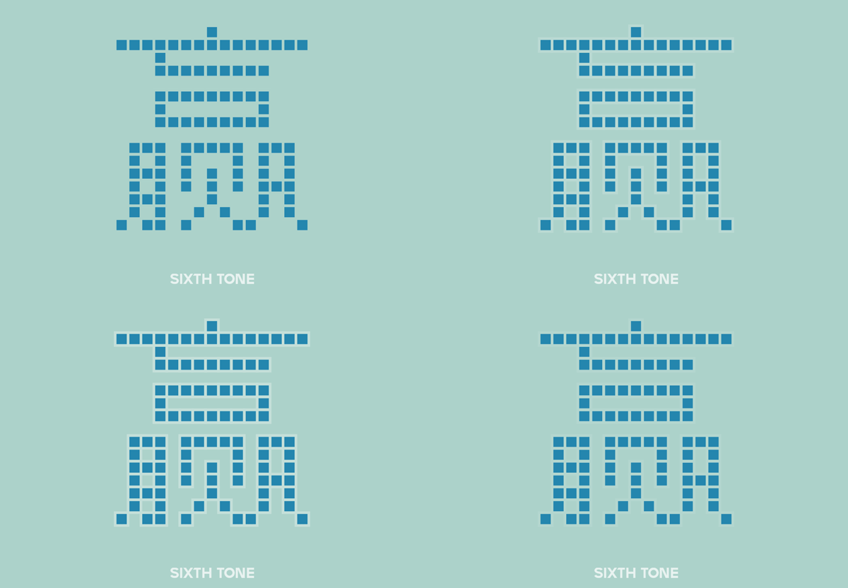
Unsatisfied with merely replicating characters, the institute’s designers also sought to push the aesthetic boundaries of the dot matrix format. Even within the constraints of a 16-by-16 grid, they wanted to find a way to reproduce the appearance of the delicate Songti typeface, which is characterized by thin horizontal strokes and thick vertical strokes, both with serif-like embellishments at their ends.
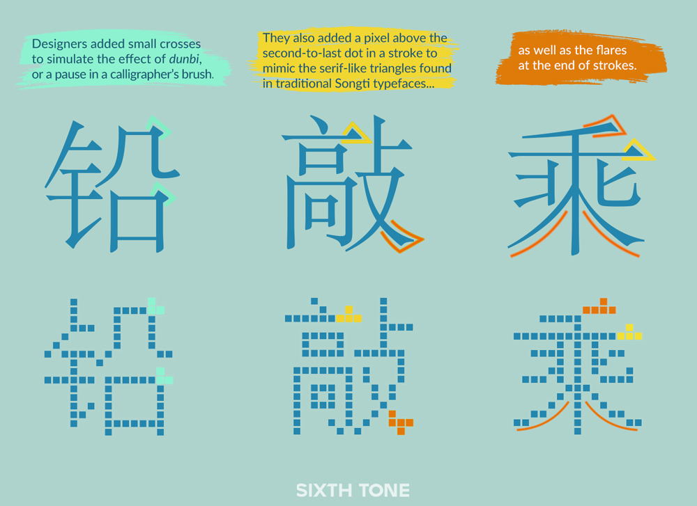
Different stroke widths were impossible to represent at such a low resolution, but the embellishments were accomplished through several clever tricks. By adding one extra dot above the second-to-last pixel from the right on important strokes, the institute’s designers discovered they could create a triangular shape that resembled a serif. By adding a small cross shape in the corner of hengzhe — horizontal strokes with long, bent hooks at the end — they were able to simulate the calligraphic effect of dunbi, or the thickness that results when the calligrapher allows their brush to momentarily linger on the page. Similar methods allowed them to render the curved shape and flares characteristic of the pie and na brushstrokes — downward flicks to the left and right, respectively.
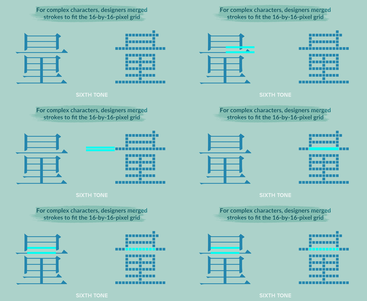
The new typeface wasn’t perfect. The 16-by-16 grid could accommodate a maximum of eight horizontal strokes, accounting for the need to leave a one-pixel space between each. For the small number of commonly used characters with more than eight horizontal strokes, the designers had no choice but to merge lines together.
Nevertheless, the final product, known as GB/T 5199, was hailed as a triumph. Declared the national standard for digital typefaces in 1985, modified versions of GB/T 5199 remain in widespread use on LED displays today.
GB/T 5199 is something of a historical outlier, however, as Chinese font designers spent the next several years working out how to cram more details into smaller squares while maintaining legibility. In the process, the delicate Songti elements favored by the Shanghai Printing Technology Research Institute were discarded in favor of the blockier and more consistent strokes of typefaces like Heiti.
This trend was driven in part by a growing realization among designers that 16-point fonts were not appropriate for all contexts. When Windows 3.2 became the first Microsoft operating system to support Chinese input in 1994, the developers were frustrated by the need to use size 16 fonts instead of the 12-point fonts favored for less complex Latin scripts. As a result, Chinese text appeared disproportionately large next to the system’s other design elements.
From Windows 95 onward, Microsoft committed to using 12-point Chinese fonts, even if it meant merging strokes — or omitting them altogether. Microsoft’s main competitor, Apple, went even further, creating dot matrix typefaces within an eight-by-eight grid. Clearly rendering Chinese characters at that size was essentially impossible, and readers’ ability to recognize individual characters was heavily dependent on context. Amazingly, this was not an impediment in most cases, and both Microsoft and Apple’s fonts were generally legible.
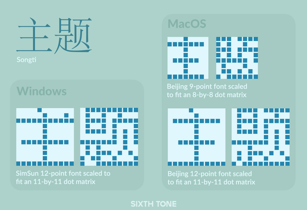
By the end of the 1990s, new vectorial rendering technologies and higher resolution monitors freed designers from the dot matrix and made it possible to display characters clearly even at smaller font sizes. Dot matrix typefaces soon fell into disuse. Today, high-definition displays like Apple’s “Retina” system offer readers an experience similar to print media, rendering even Songti’s details legible at small font sizes.
Yet, dot matrix typefaces haven’t disappeared completely, thanks in part to continued commercial demand for cheap, durable LED screens. These signs, which can be found everywhere from storefront windows to bus lines, offer the perfect niche for dot matrix fonts.
Some designers, driven by a mixture of nostalgia and curiosity, have even tried reviving the dot matrix format, including shrinking dot matrix fonts even further. In 2020, to commemorate the 60th anniversary of the trolleybus system in the southern city of Guangzhou, the design group Toursline produced a new LED display system for buses that used a seven-pixel font I designed, which allowed the city’s buses to display more information without the need to scroll.

So, the next time you visit a meticulously formatted Chinese-language website on your phone or high-resolution monitor — or place a bet at a sports lottery — don’t forget the work done by generations of designers and developers to make what you see possible. It’s easy to take things like programmable bus displays for granted, but every character on every LED board in China can be traced back to a stack of grid paper, some inky chopsticks, and the small group of pioneers who brought Chinese into the digital age. Where it goes from here is up to us.
Translator: Lewis Wright; editors: Cai Yineng and Kilian O’Donnell; visuals: Ding Yining.
(Header image and infographics: Visual elements from Dinkie Bitmap and VCG, edited by Sixth Tone)


