China to Hunt Down ‘Incorrect and Non-Standard’ Fonts
Chinese authorities are calling for companies to stop using weird fonts in books, posters, and packaging.
The National Press and Publication Administration and the National Radio and Television Administration jointly launched a nationwide campaign on April 6 to regulate the use of Chinese characters in publications and on radio, TV, and the internet. The campaign aims to “rectify the problems of incorrect and non-standard use of Chinese characters,” according to the state-run Xinhua News Agency, and to eliminate “‘ugly’ and ‘weird’ font products which contain vulgar and sloppy exaggerations and deformations in fonts, or violate the writing norms, cultural connotations, and aesthetic standards of Chinese characters.”
The campaign targets fonts used in publications, packaging, and ads, as well as film and television program titles, subtitles, and credits. Companies are expected to build systems for self-regulation, according to a notice announcing the campaign. “Whoever publishes, they’re responsible.”
The notice came one month after a minor political party proposed a ban on so-called jianghu fonts at China’s annual “Two Sessions” legislative meetings. Jianghu fonts use exaggerated strokes borrowed from calligraphy, annoying many orthodox calligraphers.
On Twitter-like platform Weibo, most users supported the move, saying the TikTok-like platform Douyin was littered with typos, Japanese characters, pinyin abbreviations, and ugly fonts.
“Some hip fonts have even changed the frame structure and radicals of Chinese characters,” one user complained.
“Don’t ruin things left by our ancestors,” another user wrote.
The design community is divided on the idea. While some say it will enhance the visual environment, others told Sixth Tone that weirdness is in the eye of the beholder.
“There is no absolute ugliness. It’s all purposeful design, isn’t it?” Melody Mo, a graphic designer based in Shanghai, told Sixth Tone.
Cheng Xunchang, a PhD student at the University of Reading whose research covers font history in China, told Sixth Tone that he hopes he won’t see “one-size-fits-all” regulation. Cheng also works closely with major font company Hanyi Fonts, and acts as a font consultant for several small design studios in China.
“There are two major categories of font products. One is for body text, and the other is for titles,” Cheng said. “Body text fonts that are meant to be read must be supervised by experts, but title fonts should be given some leeway.”
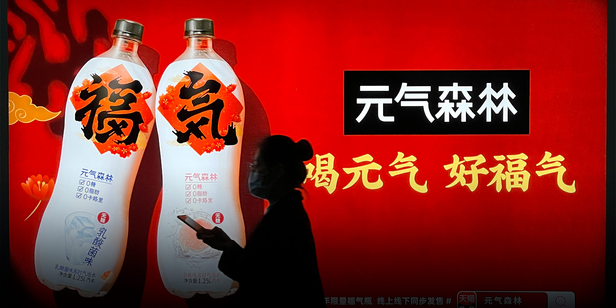
“Designers break font rules to communicate different things,” Cheng said. He gave the example of Genki Forest, a Chinese soda company that uses the Japanese character for “gas” in its logo. “They added a cross under the character. Some said it was nonsense, but a logo is actually something between text and image, just like the combination of characters in traditional Chinese New Year hangings. It’s a kind of conceptual graphic.”
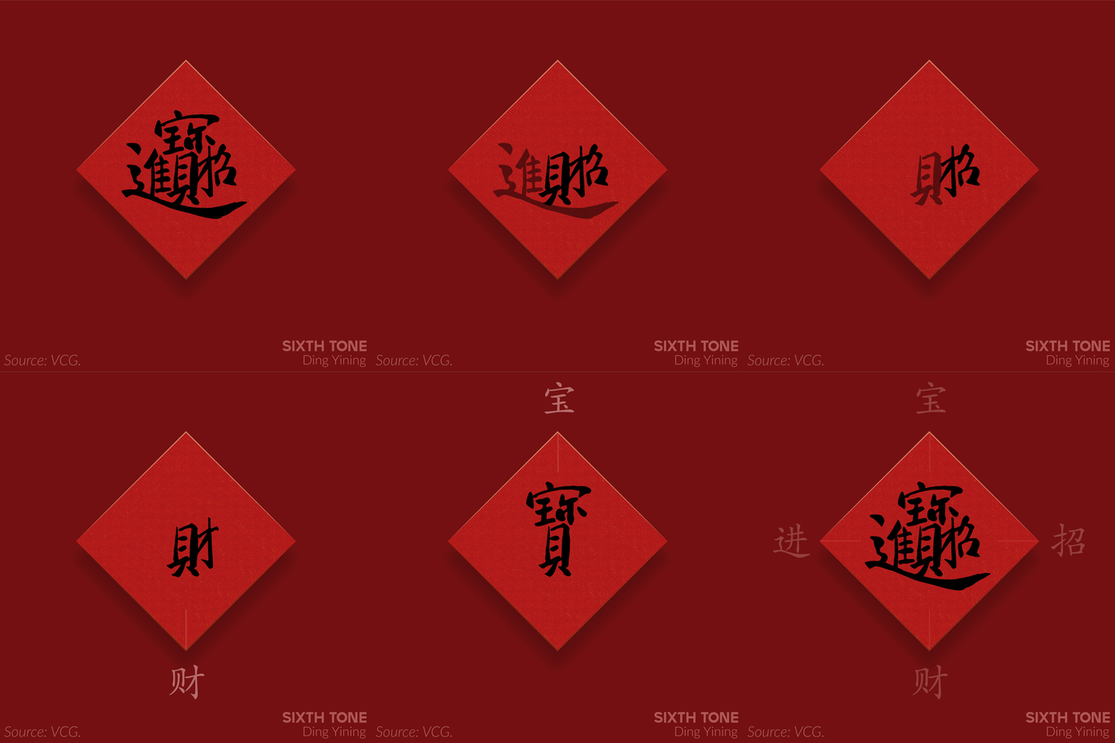
A common style of New Year decorations playfully combines a short phrase into a single combination character.

In 2020, Genki Forest changed their company logo to a Chinese style, while keeping the Japanese version as a logo on the bottle. Some language experts still can’t stand the logo, Cheng said.
Cheng said China needs new font design talents, and he worries that strict regulation will put off young designers who have a passion for font design.
But the biggest issue with Chinese font design, he says, is copyright awareness. Without better protection, companies can’t make money off good fonts. On Douyin, Cheng said, users use many fonts for free without the platform paying copyright fees itself.
“How can you improve people’s aesthetics about something, without having them spend money on it first?” Cheng said.
Editor: David Cohen.
(Header image: A woman walks past an ad for Genki Forest in Beijing, March 2021. VCG)


