Deciphering the Hanzisphere
The logotype of Muji, the Japanese retail brand famous for its rejection of logos, is appropriately minimalist. In addition to a large print “Muji,” it features four Chinese characters. Taken together, they mean “brandless quality goods.”
There are no other graphic or decorative elements. As for the characters, they are almost identical to the “traditional” Chinese characters used in Hong Kong or Taiwan. Yet the logotype is instantly identifiable as belonging to a Japanese, rather than Chinese, company.
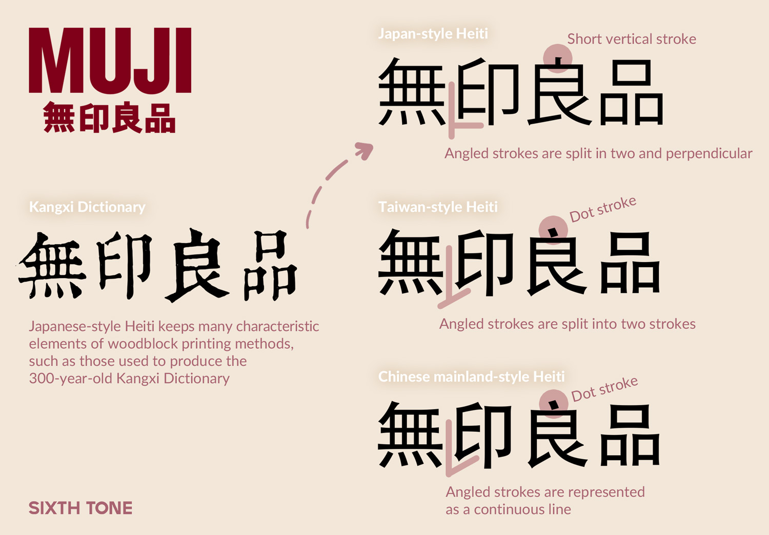
The devil is in the details — the typeface details, in this case. The characters of the Muji logotype are written in the traditional Chinese script, with no Japan-specific modifications or simplifications, but their component strokes are nevertheless distinct. Look closely at the sharp right angle of the stroke in the bottom-left corner of the second character, for example, or the short vertical stroke atop the third. Both are telltale signs that the characters, otherwise largely indistinguishable from written Chinese, were designed in Japan.

Talking about characters can be tricky. Although originating in China and most often known simply as “Chinese characters” in English, they were used widely throughout Asia. Known in Mandarin as hanzi, they are kanji in Japan, hanja in Korea, and chữ Hán in Vietnam. For clarity’s sake, and to avoid the complicated and often loaded implications of the “Chinese characters” label, I will use hanzi here. Regardless, nomenclature is not ownership, and the usage of hanzi across Asia was not a one-way street.
Indeed, rather than see kanji, hanja, and chữ Hán as separate, or simply derivations of hanzi, I prefer to think of them all as part of a broader “Hanzi-sphere.” Korea and Vietnam both eventually abandoned hanzi, though the former continues to use them in certain circumstances. Japan not only still uses hanzi; for nearly a century it was the center of printing in the Hanzi-sphere. The typefaces used in Chinese newspapers, books, and phones today are in fact products of both the lasting influence of Japanese printing, and a concerted effort to free China from Japan’s shadow.
Prior to the mid-1800s, the most widely used Chinese typeface was Songti. Developed by Ming dynasty (1368-1644) printers — it is sometimes also referred to as Mingti — its creators developed it from stylistic elements popular during the earlier Song dynasty (960-1279), albeit with major concessions made to the realities of woodblock printing. Rigidly square, Songti has none of the fluid, delicate flourishes commonly associated with Chinese calligraphy.
This was a virtue as far as Asia’s printers were concerned, as it sped up the painstaking process of carving woodblocks. Beginning in the late 1850s, however, a Presbyterian missionary named William Gamble introduced Western-style movable type printing to China. Involving the use of an electrotype process for casting character molds, his technique for the first time enabled the mass production and use of metal hanzi movable types.
The Shanghai-based American Presbyterian Mission Press, led by Gamble, soon became one of China’s leading publishers. But it was across the sea, in Japan, that his techniques arguably had their most lasting impact. Gamble’s electrotype method, together with a Songti font made using his method, arrived in Japan in 1869. Japanese foundries soon created their own Songti fonts based on Gamble’s work, even hiring type engravers from China to refine their typefaces. They also borrowed concepts from sans serif Latin fonts to create Heiti, a neat, black, Songti-based typeface with strokes of consistent thickness and minimal contrast.
Before long, Japanese Songti and Heiti fonts made their way back to China, where they were widely used, with occasional recuts or modifications, in magazines and newspapers. The Songti style, as adapted by Japanese movable-type printers, reflected the aesthetic style of woodblock printing. This is most obvious in the “dot” stroke, such as the one atop the character liang in Muji’s logotype. When handwritten, the dot is an agile, dynamic stroke; in Songti, it can take different forms — a truncated vertical stroke, a horizontal stroke, a falling stroke, or a rising stroke — but they are all more mechanical-looking than their calligraphic counterpart.

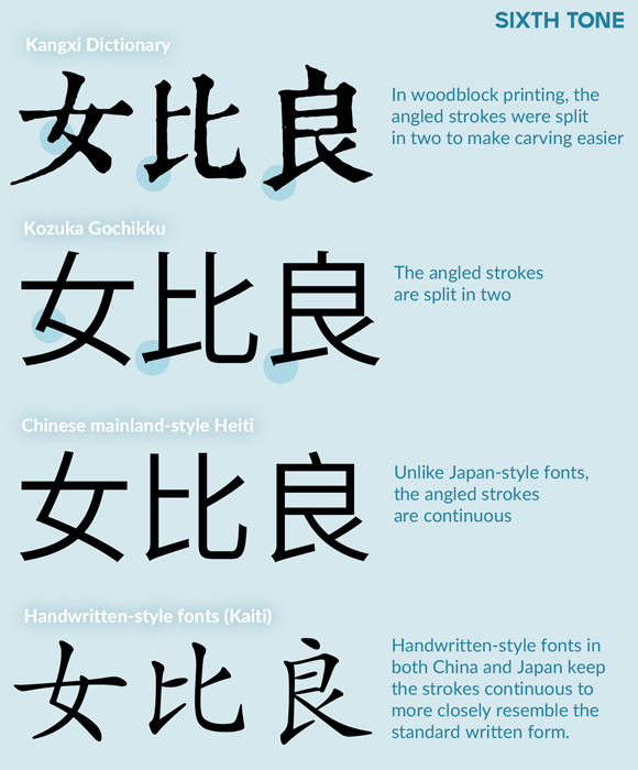
Another telltale sign of woodblock Songti is its angles. In certain circumstances, woodblock Songti renders a single turning stroke as two separate strokes with an overlapping joint. The resulting effect is sturdier, if not always elegant.
The prevalence of Japanese-influenced typefaces in China lasted until the founding of the People’s Republic in 1949. The country’s new leaders were eager to emphasize China’s independence and autonomy in institutions, technology, and culture. Likewise, the printing industry hoped to shake free of the predominance of Japanese-style Songti typefaces.
In doing so, designers opted to take printed characters in the opposite direction and make types that more closely resembled handwritten Chinese. They hoped that handwritten-style characters would be easier for the public to learn, thereby giving China’s mass literacy campaign a much-needed boost.
The woodblock dot stroke variants were dropped, while the turning stroke lost its joint and was merged into one line. And when a character had more than two of the right-falling strokes known as na, only one main stroke was preserved; the others were turned into longer dot strokes. These changes, paired with reforms undertaken to simplify Chinese characters, helped reshape hanzi into what we see on the Chinese mainland today.
The hanzi used in Hong Kong, Taiwan, and Japan did not stay static during this time, of course. They were and are in a constant state of flux thanks to similar attempts to mimic handwritten styles and simplify overly complex characters.
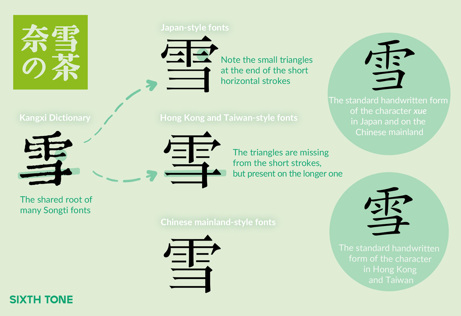
The resulting subtle regional differences in hanzi are less a barrier to communication than a boon, allowing typographers and others to code-switch depending on the context or desired meaning. Take the Chinese tea company Nayuki, for example. As the name implies, it has consciously sought to associate itself with Japan through its branding. The most obvious example is the third character of its logotype, which isn’t a hanzi at all, but Japanese katakana. But the other characters also have a distinct Japanese flavor. The second character, pronounced xue in Mandarin, has four short horizontal lines in its top half. In the Nayuki logo, each ends with a serif-like decorative triangular shape, a hallmark of Japanese typography largely absent from Chinese typefaces.

Likewise, on the famously walled-off WeChat messaging app, which does not allow external fonts, digital typographers have taken advantage of a quirk in Unicode to display their posts using smartphones’ built-in Taiwanese scripts. Taiwan-based typographers render the simplified hanzi used across the strait differently, and mainland-based WeChat users have seized on this to add occasional shots of unfamiliarity into an otherwise staid platform.
A unified, standardized script is important, but type designers across the Hanzi-sphere have always drawn inspiration from each other. Typefaces popular on the Chinese mainland today have their roots in everything from the 300-year-old Kangxi Dictionary to revolutionary posters and contemporary Japanese ads. Viewing hanzi as static or constrained by national boundaries ultimately only limits the very creativity and visual and cultural richness that make them special.
Translator: Katherine Tse; editors: Cai Yineng and Kilian O’Donnell; visuals: Ding Yining.
(Header image: Visual elements from VCG, Beijing Daily, Xu Xuecheng Archives, kongfz.com, and Ichigaya Letterpress, edited by Sixth Tone)


